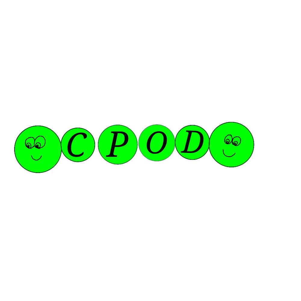
Logo Design
At CPOD this week we were tasked with creating a new logo that represents us at CPOD.
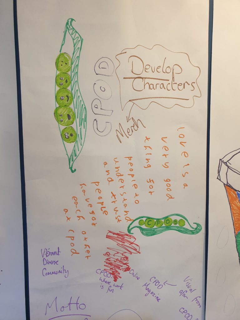
Step 1 BRAINSTORMING
First of all we get all of our ideas down onto a large piece of paper “we call this brainstorming”
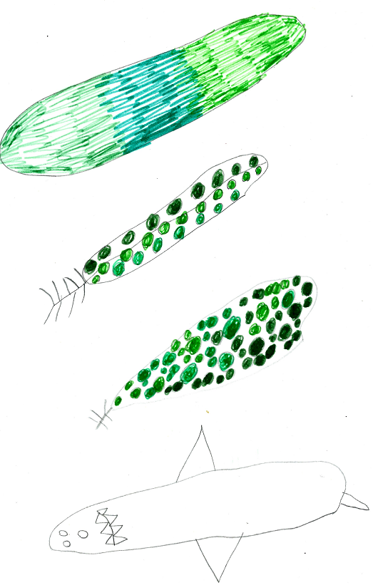
Step 2 RESEARCH
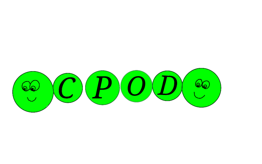
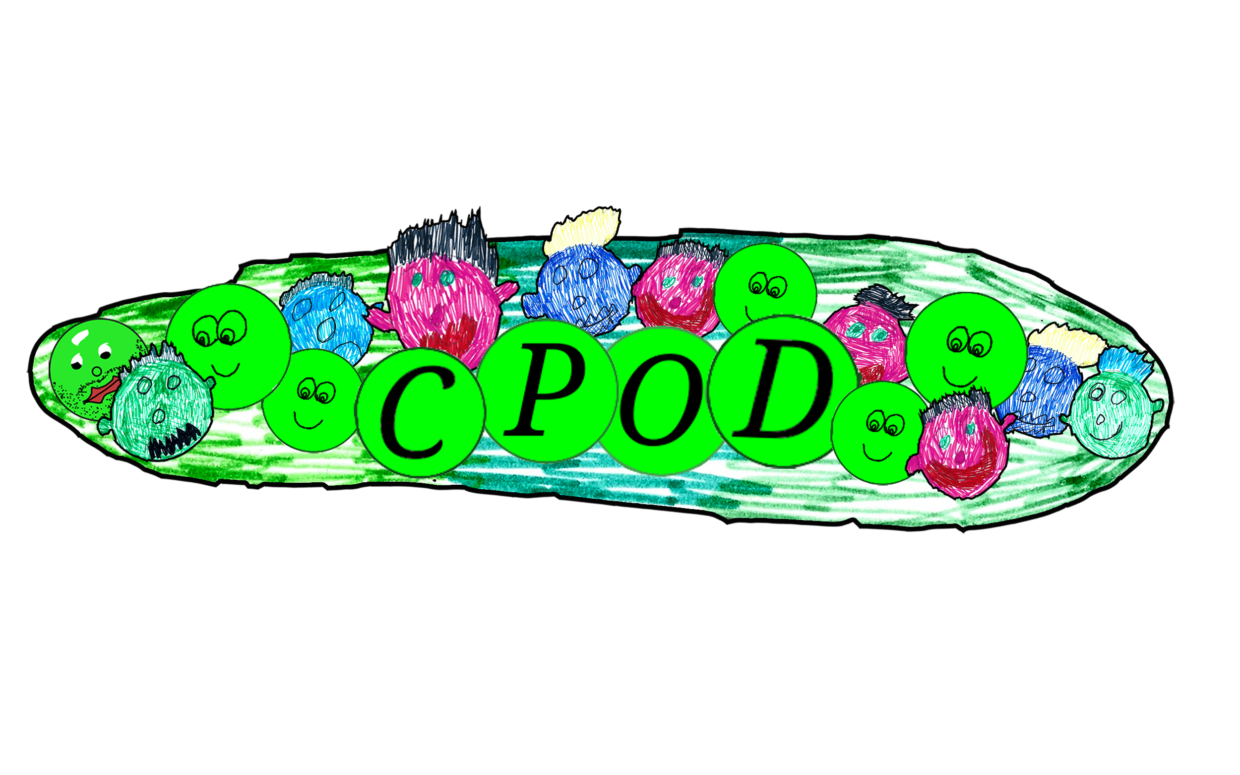
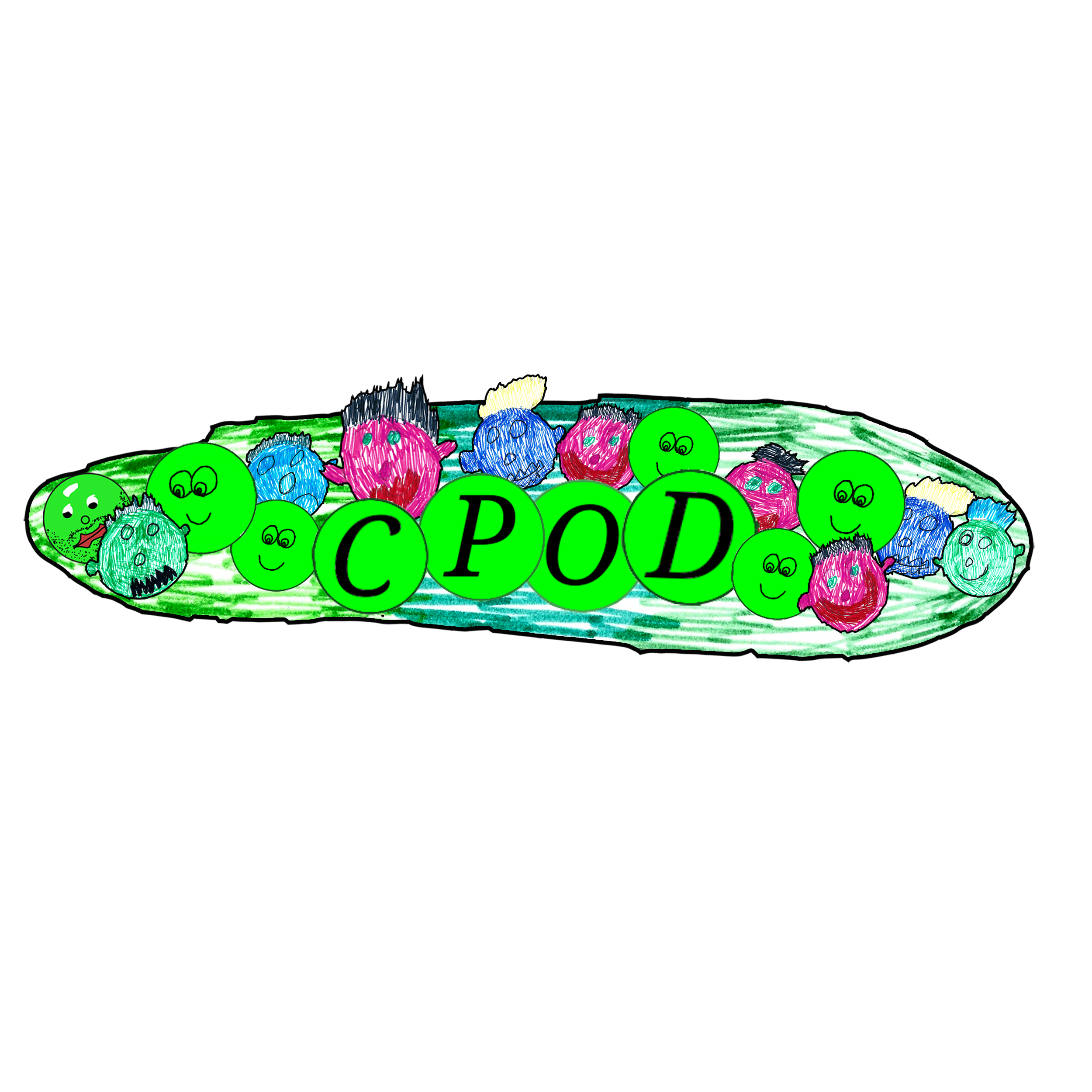
We all agreed that the best idea for a CPOD logo was a simple idea of using the term pod in its literal sense i.e Pod like Peas in a POD. Draknus went online to research all of the types of pod’s and what kind of things grow in pods.
STEP 3 DEVELOP IDEAS
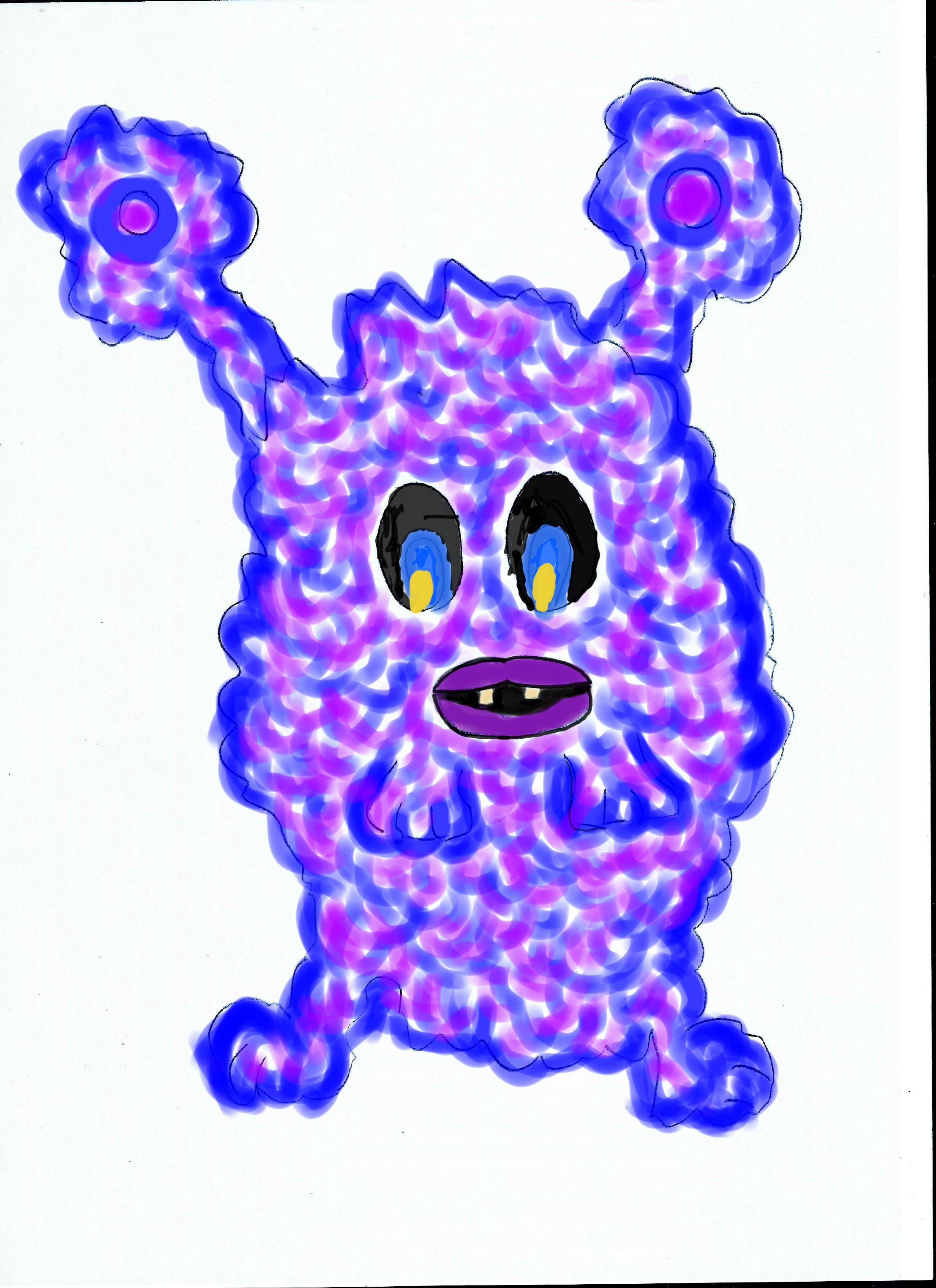
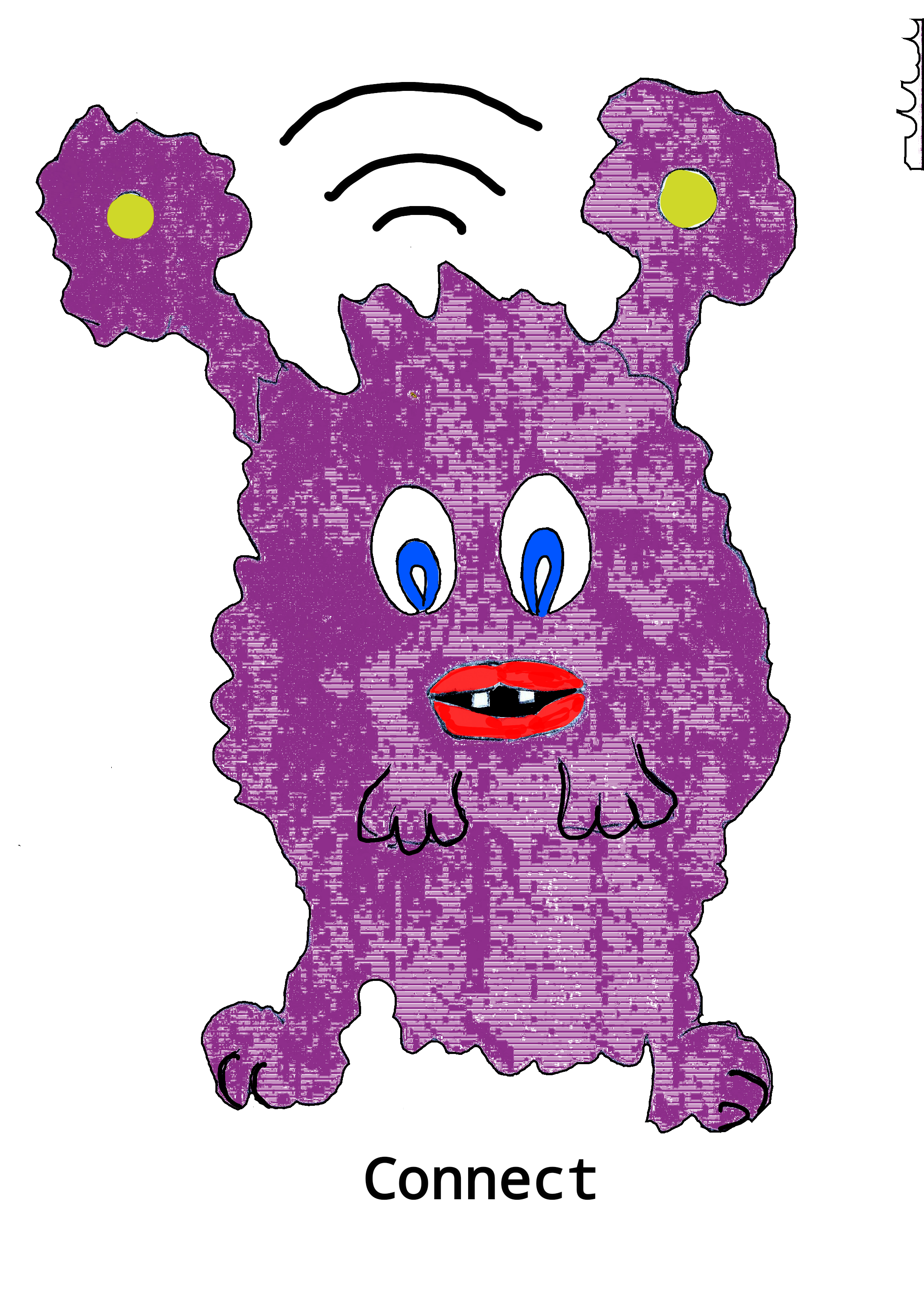
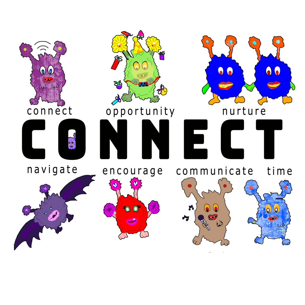
Seeking inspiration we looked at all the references that Draknus pulled into the research and we all submitted draft drawings.


Step 4 Create the Jigsaw Pieces
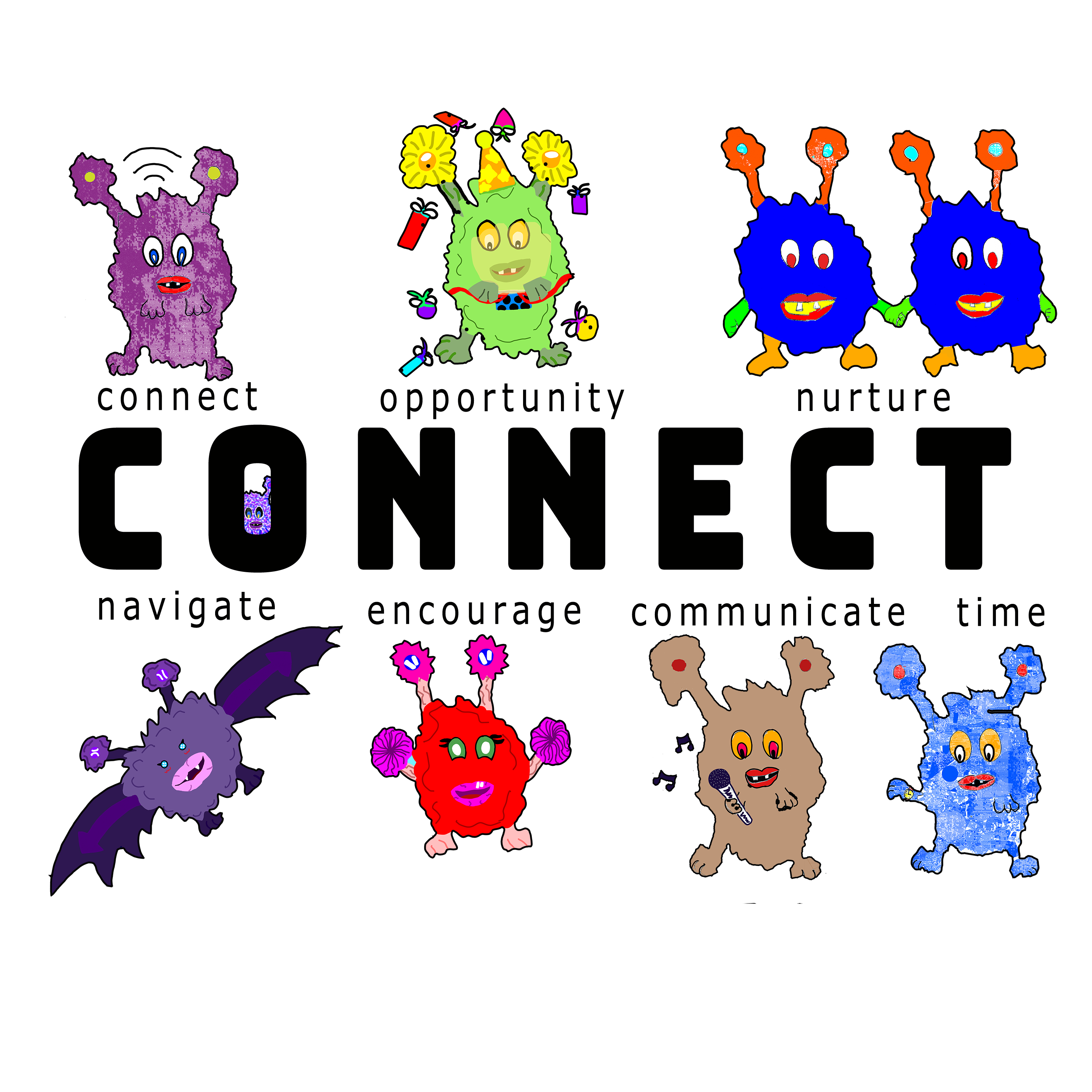
Our Next job is to take all of the submitted work and isolate each piece of the design like jigsaw pieces. These Pieces can be easily moved around on a blank canvas to create a logo design that works visually.
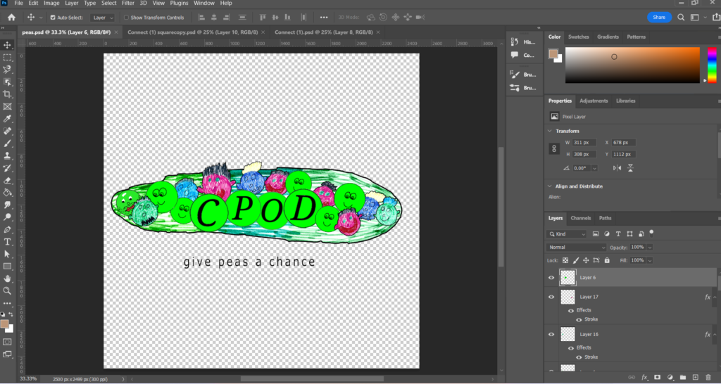

Step 5 Layout the Design
We added a black “stroke” or outline to each piece to make it stand out and look more dynamic. Some of the parts of our logo were created digitally and some were created using old fashioned pens and paper then scanned into the computer to create a digital copy.

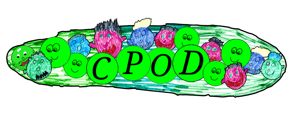
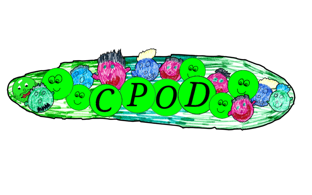
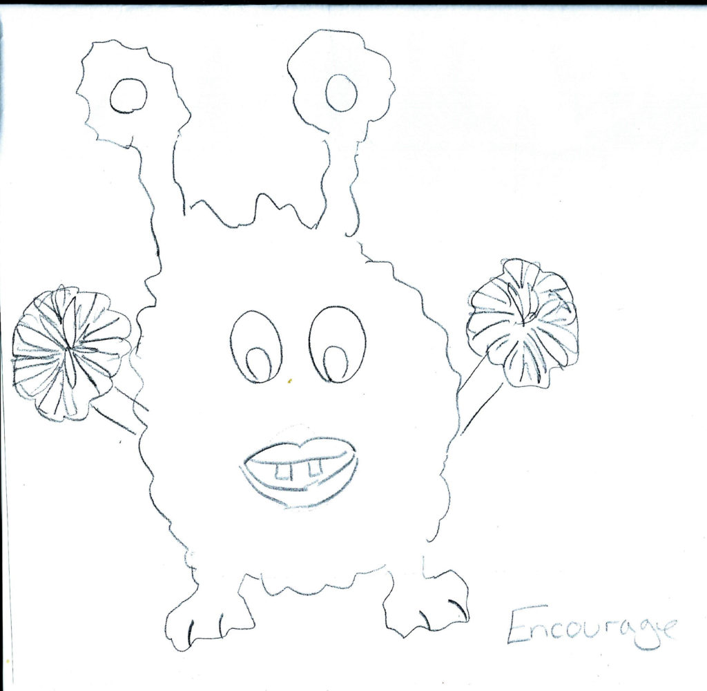
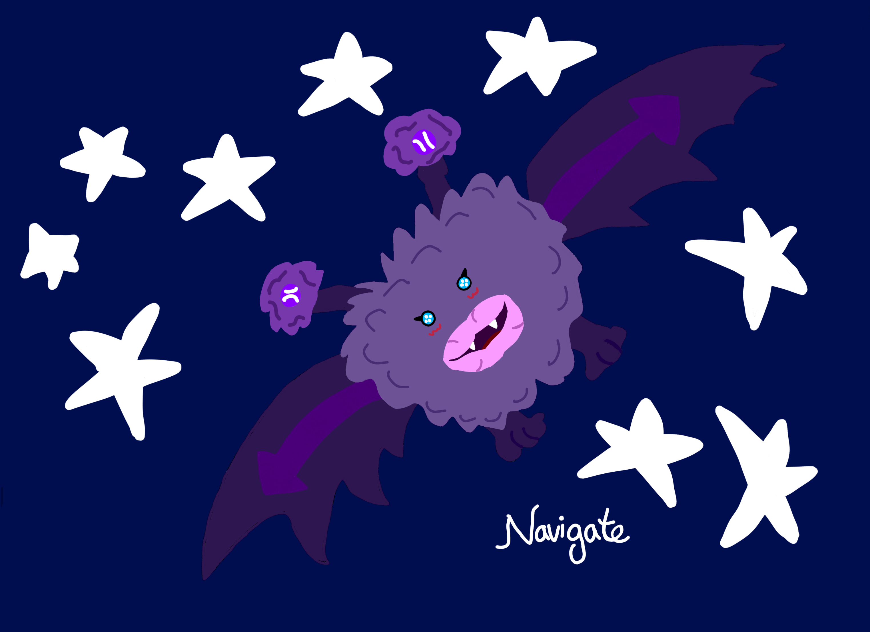
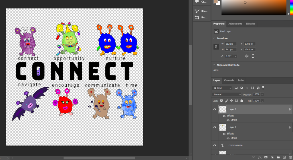
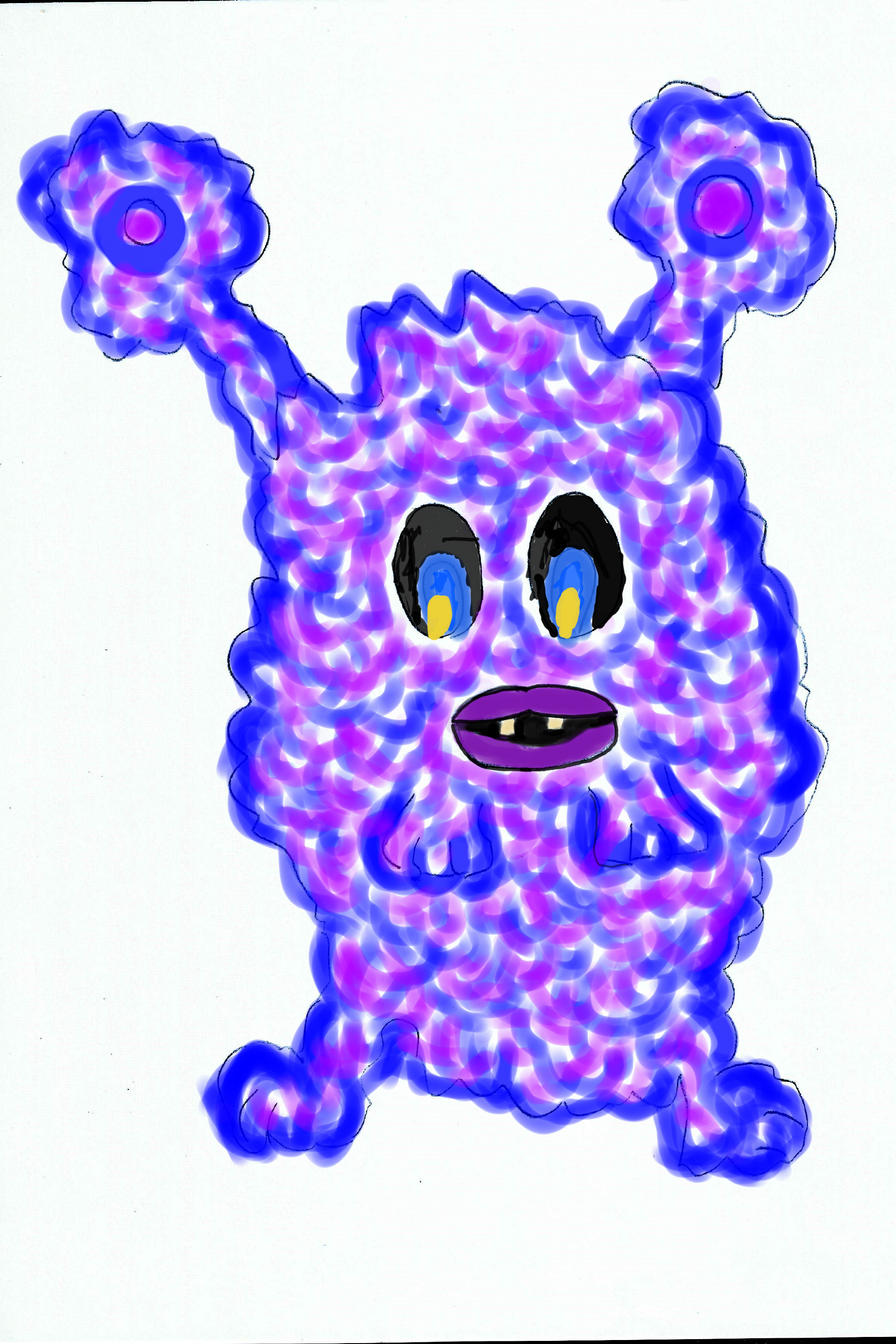
Can you find this guy in the next image?
Step 6 Finalise the logo
Once you are happy with the design we have to export it into 2 digital files. One that can used on the internet (i.e 72dpi JPG or PNG low res) and one that can be printed up (300dpi PDF file High Res)
Recent Comments